Tour
Intro.js is a lightweight JavaScript library for creating step-by-step and powerful customer onboarding tours.
Tour light
Default tour which is in light mode.
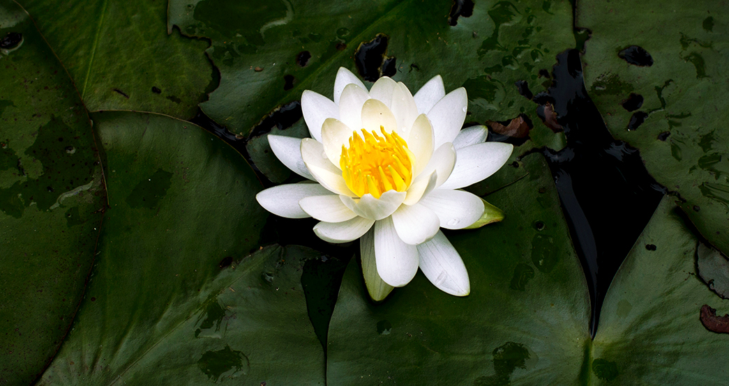
Card Title
Card Sub Title
Some quick example text to build on the card title and make up the bulk of the card's content.
Cras justo odio
Dapibus ac facilisis in
Vestibulum at eros
<template>
    <BRow>
        <BCol xl="6" sm="6">
            <BButton variant="primary" class="mb-3" @click="startTour">Start Tour</BButton>
            <BCard no-body :img-src="cardImg" img-alt="Image" img-top>
                <BCardBody>
                    <BCardTitle>Card Title</BCardTitle>
                    <BCardSubtitle class="mb-2">Card Sub Title</BCardSubtitle>
                    <BCardText>
                        Some quick example text to build on the card title and make up the bulk
                        of the card's content.
                    </BCardText>
                </BCardBody>

                <BListGroup flush>
                    <BListGroupItem>Cras justo odio</BListGroupItem>
                    <BListGroupItem>Dapibus ac facilisis in</BListGroupItem>
                    <BListGroupItem>Vestibulum at eros</BListGroupItem>
                </BListGroup>
                <BCardBody>
                    <a href="#" class="card-link">Card link</a>
                    <a href="#" class="card-link">Another link</a>
                </BCardBody>
                <BCardFooter class="last-tour-item">This is a footer</BCardFooter>
            </BCard>
        </BCol>
    </BRow>
</template>

<script setup>
//Image
import cardImg from "~/assets/img/slide1.jpg";

const { $hopscotch } = useNuxtApp();

const startTour = () => {
  if (false) {
    const tour = {
      id: "hopscotch-light",
      steps: [
        {
          target: ".card-img-top",
          title: "Card Image",
          content: "This is a Card Image!",
          placement: "right",
        },
        {
          target: ".card-title",
          title: "Card Title",
          content: "This is a Card Title",
          placement: "right",
        },
        {
          target: ".card-text",
          title: "Card Contents",
          content: "This is a Card Contents",
          placement: "right",
        },
        {
          target: ".last-tour-item",
          title: "Card Footer",
          content: "This is a Card Footer",
          placement: "right",
        },
      ],
      showPrevButton: true,
    };

    $hopscotch.startTour(tour);
  }
};
</script>
Tour dark
Change thw tour skin by adding id: "hopscotch-dark"in startTour function and you can also use id instead of class for target element.
Card Title
Card Sub Title
Some quick example text to build on the card title and make up the bulk of the card's content.
Cras justo odio
Dapibus ac facilisis in
Vestibulum at eros
<template>
    <BRow>
        <BCol xl="6" sm="6">
            <BButton variant="primary" class="mb-3" @click="startTour">Start Tour</BButton>
            <BCard no-body>
              <BCardImg id="step1" :src="cardImg" img-alt="Image" />
              <BCardBody>
                <BCardTitle id="step2">Card Title</BCardTitle>
                <BCardSubtitle class="mb-2">Card Sub Title</BCardSubtitle>
                <BCardText id="step3">
                  Some quick example text to build on the card title and make up the bulk
                  of the card's content.
                </BCardText>
              </BCardBody>

              <BListGroup flush>
                <BListGroupItem>Cras justo odio</BListGroupItem>
                <BListGroupItem>Dapibus ac facilisis in</BListGroupItem>
                <BListGroupItem>Vestibulum at eros</BListGroupItem>
              </BListGroup>
              <BCardBody>
                <a href="#" class="card-link">Card link</a>
                <a href="#" class="card-link">Another link</a>
              </BCardBody>
              <BCardFooter id="step4">This is a footer</BCardFooter>
            </BCard>
        </BCol>
    </BRow>
</template>

<script setup>
//Image
import cardImg from "~/assets/img/slide1.jpg";

const { $hopscotch } = useNuxtApp();

const startTour = () => {
  if (false) {
    const tour = {
      id: "hopscotch-dark",
      steps: [
        {
          target: "step1",
          title: "Card Image",
          content: "This is a Card Image!",
          placement: "right",
        },
        {
          target: "step2",
          title: "Card Title",
          content: "This is a Card Title",
          placement: "right",
        },
        {
          target: "step3",
          title: "Card Contents",
          content: "This is a Card Contents",
          placement: "right",
        },
        {
          target: "step4",
          title: "Card Footer",
          content: "This is a Card Footer",
          placement: "right",
        },
      ],
      showPrevButton: true,
    };

    $hopscotch.startTour(tour);
  }
};
</script>